Custom badges
Overview
The Release theme features a comprehensive badge system that allows you to display various types of informational badges on your products. This guide covers how to create, customize, and manage custom badges to enhance your product presentation and provide important information to customers at a glance.
Types of Badges Available
The Release theme supports several types of badges:
- Custom Badges - Create your own badges using product tags
- Discount Badges - Automatic percentage display for sale items
- Sold Out Badges - Automatic display when products are unavailable
- Preorder Badges - Display for products available for preorder
Creating Custom Badges
Using Product Tags
The easiest way to create custom badges is through product tags:
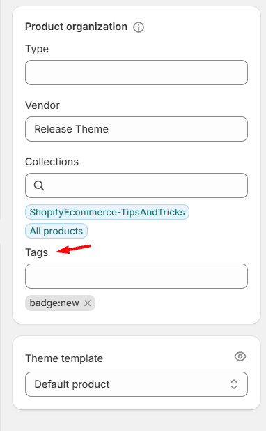
Step 1: Access Product Settings
- In Shopify Admin, go to Products
- Select the product you want to add a badge to
- Scroll to the Search engine listing preview section
- Find the Tags field
Step 2: Add Badge Tags
- Add tags using the format:
badge:Your Badge Text - Examples:
badge:New Arrivalbadge:Limited Editionbadge:Bestsellerbadge:Eco-Friendly
Step 3: Save Changes
- Click Save to apply the badge tags
- Badges will appear automatically on product cards and product pages
Example:
Badge Tag Examples
Promotional Badges:
badge:Newbadge:Featuredbadge:Staff Pickbadge:Hot Deal
Product Attributes:
badge:Organicbadge:Handmadebadge:Veganbadge:Sustainable
Inventory Status:
badge:Low Stockbadge:Last Chancebadge:Back in Stock
Accessing Badge Settings
In Shopify Admin:
- Navigate to Online Store > Themes
- Click Customize on your Release theme
- Look for the Product Cards section in the theme settings
- Scroll to the Badges header for badge-specific controls
Global Badge Settings
Badge Visibility Controls
Show Product Card Badges
- Toggle to enable/disable custom badges on product cards
- Default: Enabled
- Controls display of badges created via product tags
Show Discount Badges
- Toggle to enable/disable automatic discount percentage badges
- Default: Enabled
- Automatically calculates and displays savings percentage
Show Sold Out Badges
- Toggle to enable/disable sold out status badges
- Default: Enabled
- Displays when products are unavailable
Badge Positioning
Badge Position
- Choose where badges appear on product cards
- Options:
- Start - Badges appear at the beginning/left side
- End - Badges appear at the end/right side (default)
Badge Colors
Discount Badge Background Color
- Controls the background color of discount badges
- Default: #EF2D2D (red)
- Use the color picker to match your brand colors
Discount Badge Text Color
- Controls the text color of discount badges
- Default: #FFFFFF (white)
- Ensure good contrast with background color
Section-Specific Badge Settings
Product Page Badges: When editing individual product page sections, you can control:
- Show Custom Badges - Toggle custom badges on/off
- Show Discount Badges - Toggle discount badges on/off
- Show Sold Out Badges - Toggle sold out badges on/off
Badge Styling Options:
Corner Radius
Badges inherit corner styling from your button radius settings:
- Square Corners - Clean, modern look
- Rounded Corners - Softer, friendlier appearance
Typography
Badge text uses the following default styling:
- Font Size: Extra small (responsive)
- Font Weight: Medium
- Text Transform: Uppercase
- Letter Spacing: 0.14rem
- Line Height: Small
Best Practices
Badge Content
Keep Text Short:
- Limit badge text to 1-3 words
- Use clear, descriptive language
- Avoid special characters in badge tags
Be Consistent:
- Use the same badge text for similar products
- Maintain consistent capitalization
- Create a badge style guide for your team
Badge Usage
Don't Overuse:
- Limit to 1-3 badges per product
- Only use badges that add genuine value
- Remove outdated badges regularly
Strategic Placement:
- Use badges to highlight key selling points
- Emphasize unique product features
- Draw attention to promotions or urgency
Performance Considerations
Tag Management:
- Regularly audit and clean up unused badge tags
- Use bulk operations for applying badges to multiple products
- Consider using Shopify's automated collections for badge-eligible products
Advanced Badge Customization (for developers or support personnel)
For advanced styling, you can add custom CSS to modify badge appearance:
Key CSS Classes:
.product-card__badges- Container for all badges.product-card__badge- Individual badge styling.product-card__badge--discount- Discount badge specific styling.product-card__badge--rounded- Rounded corner badges.product-card__badge--square- Square corner badges
CSS Variables Available:
--color-badge-discount-background- Discount badge background--color-badge-discount-foreground- Discount badge text--color-tag-background- Regular badge background--color-tag-foreground- Regular badge text
Was this article helpful?
Have more questions? Submit a request