Simple menu and megamenu
Overview
Megamenus are large dropdown menus that help customers navigate your store easily. Instead of simple text links, megamenus can show multiple columns of links, featured images, and even product cards. This guide will show you how to set up different types of megamenus that make shopping intuitive and visually appealing for your customers.
What You'll Learn
- How to create different types of megamenus
- How to add image cards to your menus
- How to set up product card menus
- How to use the new Menu item position system
- Best practices for menu organization
Before You Start
What you need:
- Access to your Shopify Admin
- A main navigation menu created in Shopify
- About 45 minutes to complete the full setup
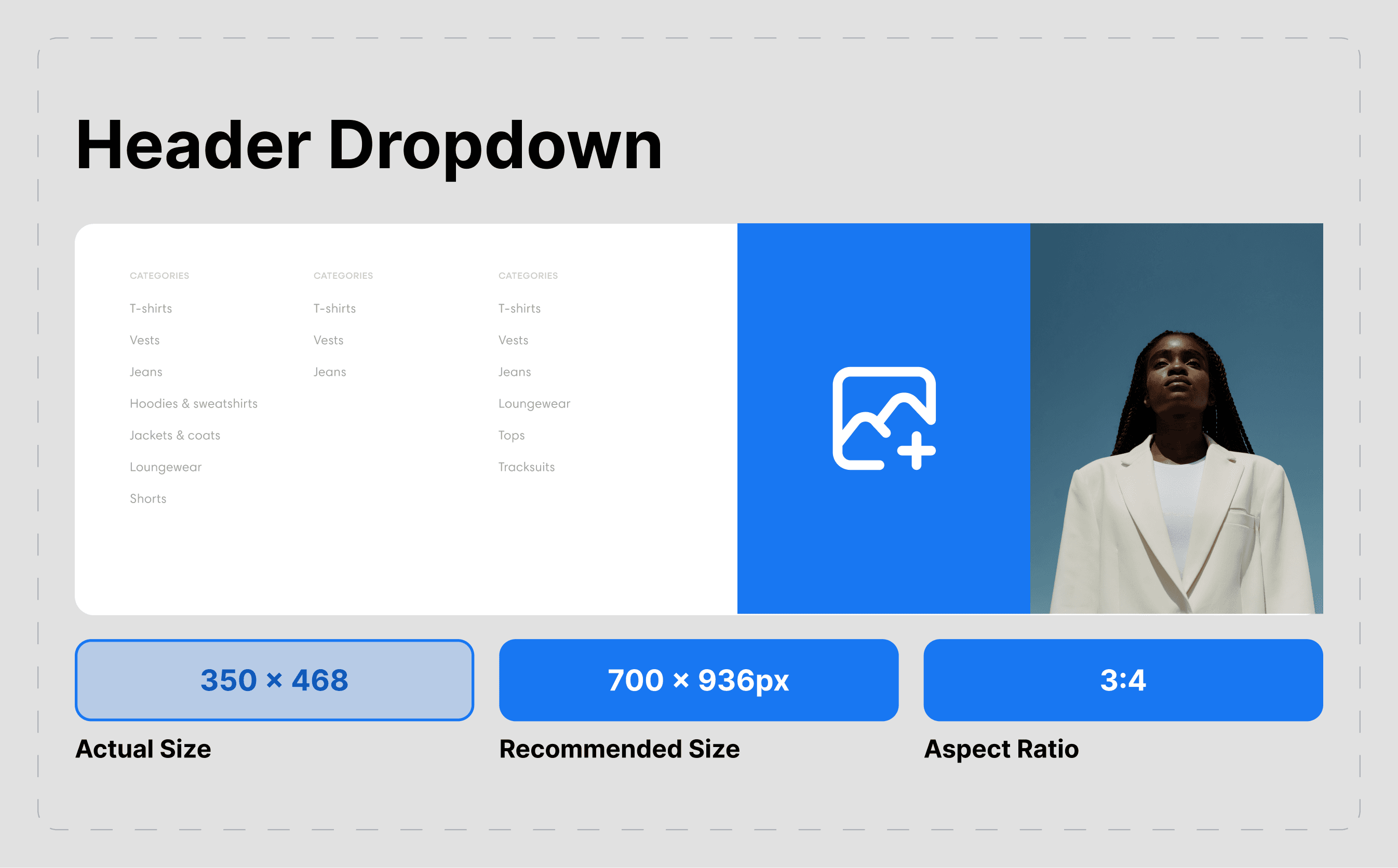
- Images for menu cards (optional, recommended size: 400x300 pixels)
Don't worry if you're not technical - this guide uses simple, step-by-step instructions that anyone can follow.
Understanding Megamenu Types
What is a megamenu? A megamenu is a large dropdown that appears when customers hover over or click your main navigation items. Unlike regular dropdowns that show a simple list, megamenus can display multiple columns, images, and rich content.
Types of megamenus you can create:
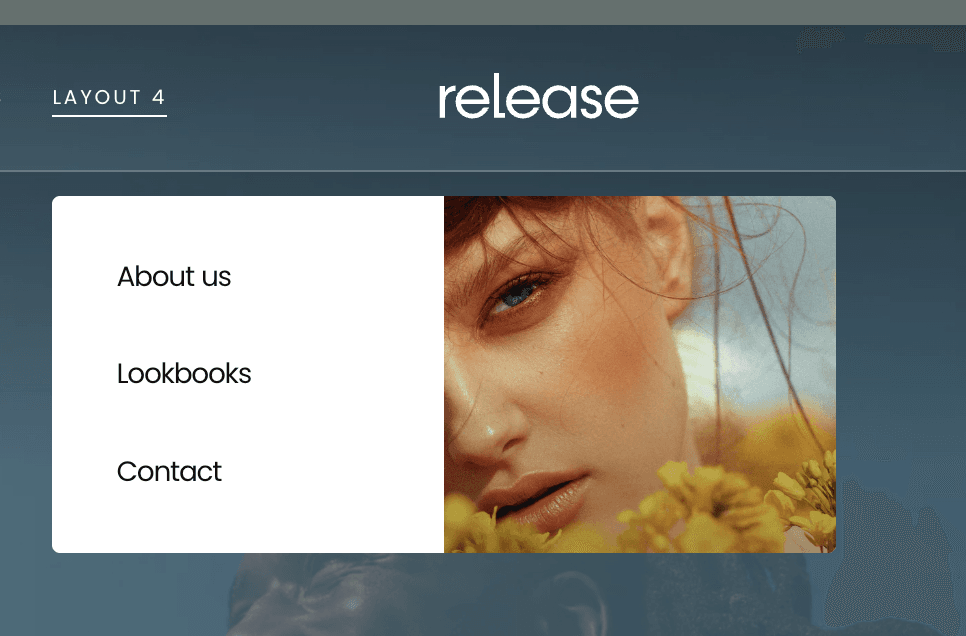
- Normal Megamenu - Multiple columns of text links only
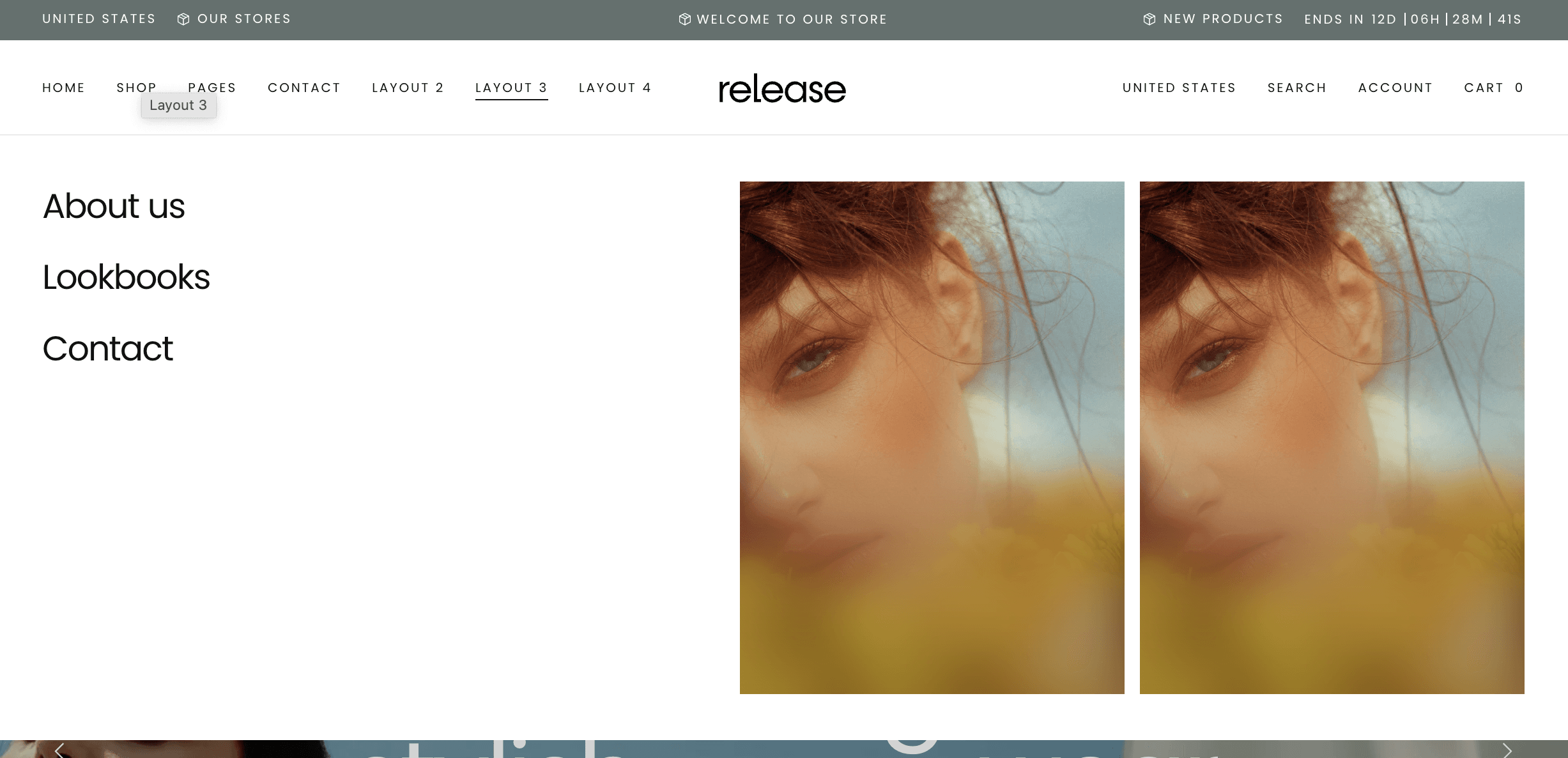
- Megamenu with Image Cards - Text links plus featured image cards
- Card-Only Megamenu - Composed entirely of image cards
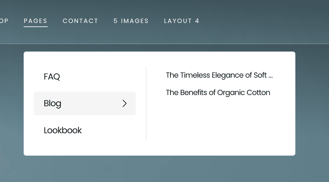
- Simple Dropdown - Traditional single-column menu
Simple Dropdown
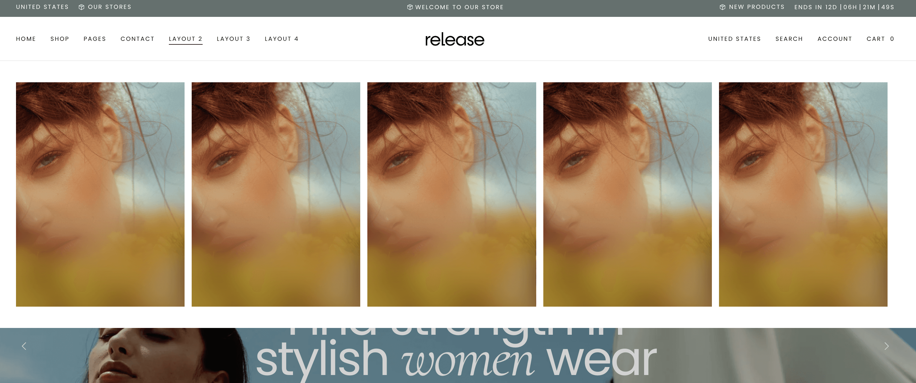
Simple menu with Image Cards:
Megamenu with Image Cards:
Card-Only Megamenu
Quick Setup (10 Minutes)
Step 1: Access Your Theme Settings
- Go to your Shopify Admin
- Click Online Store → Themes
- Click Customize on your Release theme
- Click on your Header section
- Look for Navigation or Menu settings
Step 2: Enable Megamenu
- Find your main navigation menu
- Look for Menu type or Display type setting
- Select Megamenu from the dropdown
- Click Save
Step 3: Test Your Basic Megamenu
- Preview your store
- Hover over your main navigation items
- You should now see a wider dropdown instead of a simple list
🎉 Congratulations! You now have a basic megamenu. Let's make it look amazing with the advanced setups below.
Setting Up Normal Megamenu (Text Only)
Best for: Stores with many product categories that need organized, easy-to-scan navigation.
What you'll get: Multiple columns of clean text links without any images.
Step 1: Organize Your Menu Structure
- Go to Online Store → Navigation in Shopify Admin
- Click on your main menu
- Organize your menu items into logical groups
- Example structure:
- Women's Clothing
- Tops
- Dresses
- Pants
- Shoes
- Men's Clothing
- Shirts
- Pants
- Accessories
- Women's Clothing
Step 2: Configure Megamenu Display
- Go to Online Store → Themes → Customize
- Click on Header section
- Find your navigation settings
- Set Menu type to Megamenu
- Set Show images to Off or Disabled
- Choose number of columns (typically 2-4 works best)
- Click Save
Step 3: Customize Appearance
- In theme settings, look for Menu styling options
- Adjust text size, spacing, and colors
- Set hover effects for better user experience
- Preview and adjust until it looks perfect
Result: Clean, organized megamenu that displays all your categories in an easy-to-scan format.
Setting Up Megamenu with Image Cards
Best for: Highlighting featured collections, sales, or new arrivals alongside regular navigation.
What you'll get: Regular text links plus eye-catching image cards that promote specific items.
Step 1: Prepare Your Images
Image requirements:
- Size: 400x300 pixels (recommended)
- Format: JPG or PNG
- File size: Under 200KB each
- Style: Consistent lighting and composition
Step 2: Enable Image Cards
- Go to Online Store → Themes → Customize
- Click on Header section
- Find megamenu settings
- Set Menu type to Megamenu with cards
- Enable Show featured cards
Step 3: Configure Menu Item Position System
Understanding the new system: Instead of typing menu names, you now select which menu item to enhance with cards using numbered positions.
- Look for Menu item position setting
- You'll see a dropdown with numbers: 1, 2, 3, 4, etc.
- Position 1 = Your first main menu item (e.g., "Women")
- Position 2 = Your second main menu item (e.g., "Men")
- Position 3 = Your third main menu item (e.g., "Accessories")
Step 4: Add Image Cards to Specific Menu Items
- Select Menu item position: Choose "2" (for your second menu item)
- Card title: "Summer Collection"
- Card image: Upload your prepared image
- Card link: Link to your summer collection
- Card description: "Discover our latest summer styles"
- Click Add another card if you want more cards
- Repeat for other menu positions as needed
Step 5: Organize Card Layout
- Set Cards per row: Usually 2-3 works best
- Card position: Choose left, center, or right alignment
- Card size: Small, medium, or large
- Preview and adjust
Result: Professional megamenu with both navigation links and promotional image cards.
Setting Up Card-Only Megamenu
Best for: Visual brands that want to showcase products or collections with large, beautiful images.
What you'll get: Megamenu composed entirely of clickable image cards, no text links.
Step 1: Plan Your Card Layout
Decide on:
- How many cards per menu item (4-8 works well)
- What each card will promote
- Card arrangement and flow
Example layout for "Women" menu:
- Card 1: New Arrivals
- Card 2: Dresses
- Card 3: Tops
- Card 4: Sale Items
Step 2: Configure Card-Only Display
- Go to Online Store → Themes → Customize
- Click on Header section
- Set Menu type to Cards only or Full card layout
- Disable text links: Set Show navigation links to Off
Step 3: Set Up Cards Using Menu Item Position
For Position 1 (your first menu item):
- Menu item position: Select "1"
- Add your first card:
- Title: "New Arrivals"
- Image: Upload high-quality image
- Link: Link to new arrivals collection
- Description: Brief, compelling text
- Click Add another card
- Repeat for all cards under this menu item
For Position 2 (your second menu item):
- Menu item position: Select "2"
- Add cards relevant to this menu section
- Repeat the process
Step 4: Style Your Cards
- Card size: Choose uniform size for all cards
- Cards per row: Set to 2, 3, or 4 depending on your design
- Card spacing: Adjust gaps between cards
- Hover effects: Enable for better interaction
- Text overlay: Position text on images or below
Result: Stunning visual megamenu that showcases your products like a mini-catalog.
Setting Up Simple Dropdown Menus
Best for: Mobile-friendly navigation or stores with fewer categories.
What you'll get: Traditional single-column dropdown menus that are clean and simple.
Step 1: Choose Simple Display
- Go to Online Store → Themes → Customize
- Click on Header section
- Set Menu type to Simple dropdown or Standard
- This creates traditional, single-column dropdowns
Step 2: Organize Menu Items
- Keep menu items organized and logical
- Limit submenu items to 8-10 for best user experience
- Use clear, descriptive names
- Group related items together
Step 3: Customize Simple Menu Appearance
- Adjust dropdown width
- Set text alignment (left, center, right)
- Configure hover colors and effects
- Ensure mobile-friendly sizing
Result: Clean, efficient navigation that works great on all devices.
Understanding Menu Item Position System
How the new system works:
Instead of typing menu titles, you now use a numbered system that corresponds to your menu items in order.
Example: If your main menu has these items:
- Home
- Women
- Men
- Accessories
- About
- Contact
Then in theme settings:
- Position 1 = Home
- Position 2 = Women
- Position 3 = Men
- Position 4 = Accessories
- Position 5 = About
- Position 6 = Contact
To add cards to the "Women" menu:
- Select Menu item position: "2"
- Add your cards and settings
- These will appear when customers hover over "Women"
To add cards to "Accessories":
- Select Menu item position: "4"
- Configure cards for accessories
- These appear when hovering over "Accessories"
Benefits of this system:
- No typing errors with menu names
- Automatically updates if you rename menu items
- Works in any language
- Prevents configuration mistakes
Advanced Megamenu Configurations
Mixed Layout Megamenus
You can combine different elements in one megamenu:
Step 1: Enable Mixed Layout
- Set Menu type to Mixed or Custom
- Enable both text links and cards
Step 2: Configure Each Section
- Left side: Regular navigation links
- Right side: Featured image cards
- Bottom: Promotional banner (optional)
Step 3: Balance the Layout
- Use 60% for links, 40% for cards
- Ensure mobile responsiveness
- Test user flow and navigation
Responsive Design Settings
Desktop Configuration:
- Full-width megamenus
- Multiple columns
- Large image cards
- Detailed descriptions
Mobile Configuration:
- Simplified accordion-style menus
- Single-column layout
- Smaller images
- Touch-friendly buttons
Tablet Configuration:
- Medium-sized layout
- 2-column design
- Optimized image sizes
Best Practices for Great Megamenus
Menu Organization
✅ Do this:
- Group related items logically
- Use clear, descriptive category names
- Limit main menu items to 6-8
- Keep submenu depth to 2 levels maximum
❌ Avoid this:
- Too many top-level menu items
- Confusing or vague category names
- Deeply nested menu structures
- Inconsistent naming conventions
Image Selection
For menu cards:
- Use high-quality, professional images
- Maintain consistent style and lighting
- Show products in use when possible
- Include lifestyle shots for inspiration
Technical considerations:
- Optimize images for web (under 200KB)
- Use consistent dimensions across all cards
- Test images on different screen sizes
- Ensure fast loading times
User Experience
Make navigation intuitive:
- Put most important items first
- Use familiar category names
- Include search functionality
- Provide breadcrumb navigation
Mobile-first approach:
- Test on actual mobile devices
- Ensure touch targets are large enough
- Simplify mobile menu structure
- Use collapsible sections effectively
Testing Your Megamenus
Desktop Testing:
- Hover interactions work smoothly
- All links point to correct pages
- Images load quickly and clearly
- Menu doesn't cover important content
- Text is readable at all sizes
Mobile Testing:
- Touch interactions work properly
- Menu collapses appropriately
- All items remain accessible
- Performance is smooth
- Text remains legible
Cross-Browser Testing:
- Chrome
- Safari
- Firefox
- Edge
- Mobile browsers
Performance Testing:
- Menus load quickly
- Images don't slow down page
- Smooth animations
- No layout shifts
Troubleshooting Common Issues
Problem: Megamenu not appearing
Quick fixes:
- Check that Menu type is set to Megamenu
- Verify your navigation menu has submenu items
- Clear browser cache and test again
- Ensure theme sections are properly configured
Problem: Images not showing in cards
Quick fixes:
- Check image file size (should be under 500KB)
- Verify image format (JPG, PNG, or WebP)
- Ensure Menu item position is set correctly
- Confirm images are properly uploaded
Problem: Menu positioning issues
Quick fixes:
- Verify Menu item position numbers match your menu order
- Check that menu items exist in your navigation
- Ensure no duplicate position numbers are used
- Test with different menu items to isolate the issue
Problem: Mobile menu not working
Quick fixes:
- Check mobile-specific settings in theme customizer
- Test on actual mobile device, not just browser resize
- Verify touch targets are large enough
- Ensure mobile menu toggle is functional
Getting Help
If you need assistance:
- Start simple - Begin with basic megamenu, add complexity gradually
- Test thoroughly - Check all devices and browsers
- Use theme documentation - Look for video tutorials and guides
- Contact theme support - Include screenshots of your settings
- Check Shopify forums - Other merchants often have helpful solutions
Before contacting support:
- Note which Menu item position numbers you're using
- Screenshot your menu structure in Shopify Admin
- List which devices/browsers show problems
- Include your store URL for easier troubleshooting
Final Tips
✅ Plan your structure - Map out your menu before building
✅ Keep it simple - Don't overwhelm customers with too many options
✅ Use quality images - Poor images hurt your brand
✅ Test everything - Check on multiple devices and browsers
✅ Monitor performance - Ensure fast loading times
✅ Update regularly - Keep menu content fresh and relevant
Time investment:
- Basic megamenu: 15-20 minutes
- Megamenu with cards: 45-60 minutes
- Card-only megamenu: 60-90 minutes
- Testing and refinement: 30 minutes
Remember: Great navigation helps customers find what they're looking for quickly. Take time to organize your menu structure logically, and your customers will have a better shopping experience!
Contact UsWas this article helpful?
Have more questions? Submit a request