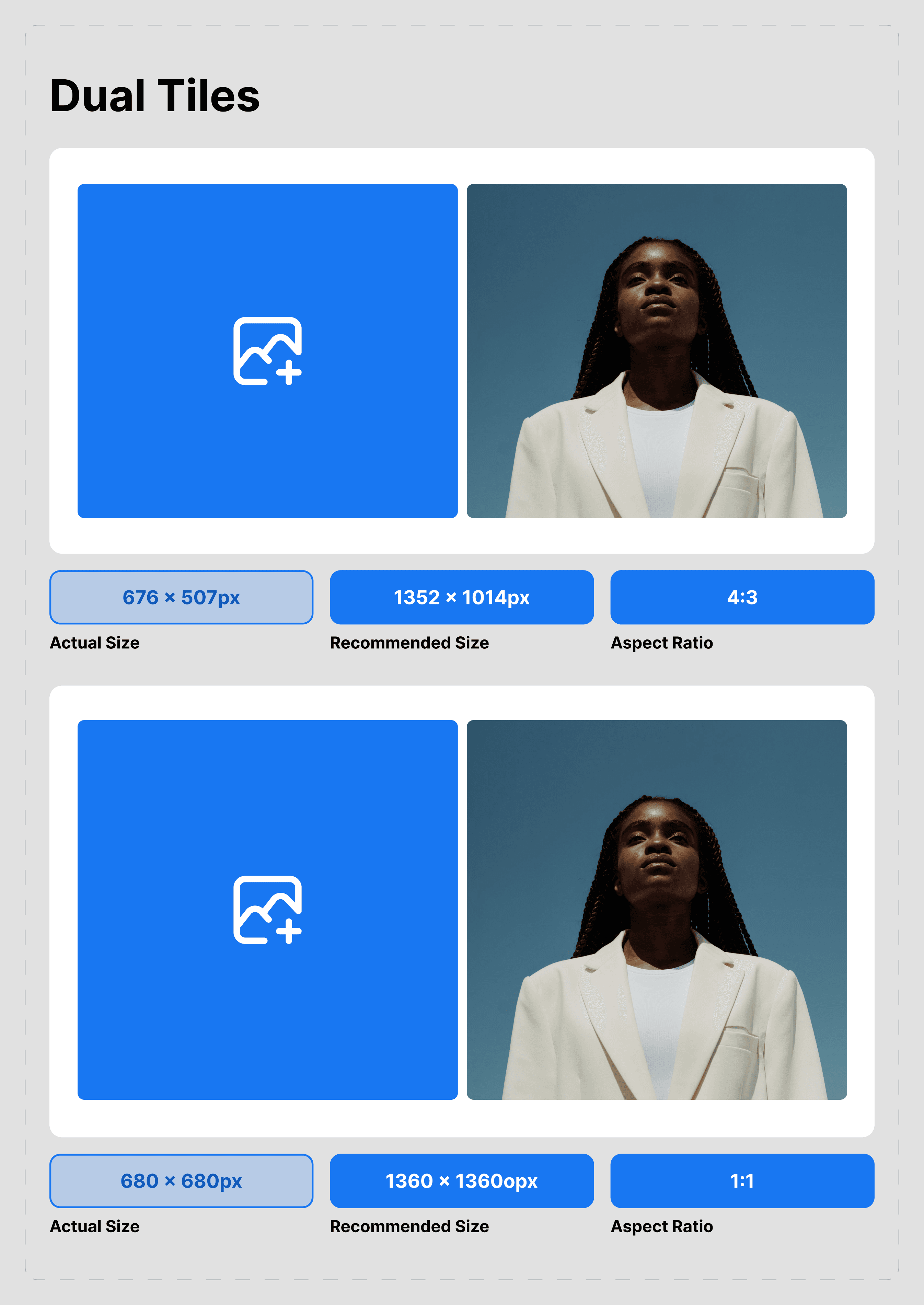
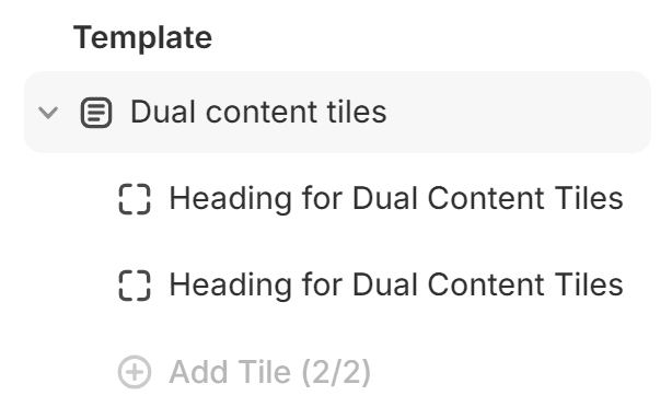
Dual content tiles

Path: Customizer > Any page > Template > Add section > Dual content tiles

About:
As your imagination and enthusiasm need a way to be expressed, we’ve created this section that features a variety of options in which you can present the content you want to promote.
Customization settings:
The section is split between the main layout options and the customization options for each of the two tiles.
The main layout options feature changes that will apply to the entire section (width, aspect ratio, size, height) as well as spacing settings.
Similarly, the tiles contain layout options and can be further edited with:
- Image
- Video
- External video
- Content title and body
- Button label and URL
- Product
It is important to note that the media of this section works on a hierarchy of Image < Video < External Video. Each option may be edited, but video supersedes image, while external video supersedes both video and image.
Recommendation:
As the feature contains a wide variety of customization options, the best way to learn how to use it is by testing each option while checking the effect it has.
Contact UsWas this article helpful?
Have more questions? Submit a request