Header
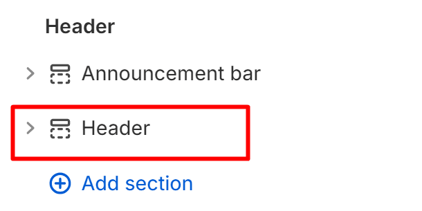
Path: Customizer > Any Page > Header > Header
About:
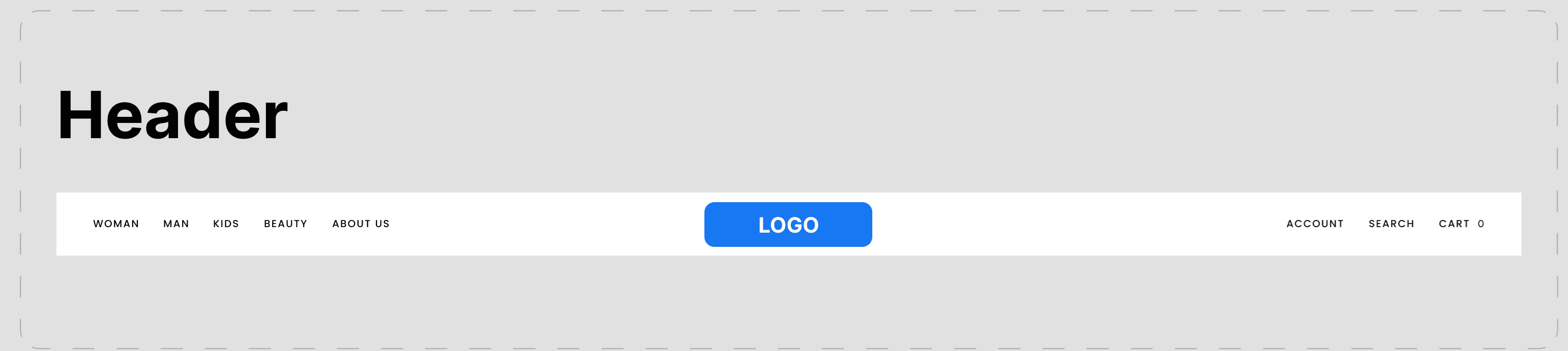
The header is the rectangular area that can be found on the upper side of the pages in your store, featuring your logo, navigation, search bar, and cart icon. It appears on every page to promote your company’s brand, make it instantly recognisable to your visitors, and provide easier access across your store's principal elements and pages.
Note: This is a fixed section in your store – it cannot be moved.
The header’s customization options can be split into the following:
- General
- Color Scheme
- Logo
- Navigation
- Country Drawer
- First Additional Link
- Second Additional Link
- Custom CSS
General:
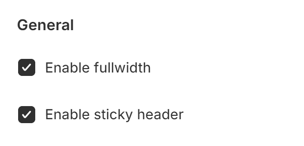
The general features that can be found in the header include:
- Enable fullwidth – When this box is checked, the header will spread to cover the entire width of the user's screen that accesses your store. The header will remain in a default position when the box remains unchecked.
- Enable sticky header – When this option’s box is checked, the header will remain visible on the page as the customer scrolls down on the current page; if it remains unchecked, the header will remain in a fixed position on the top of the page, and will not follow the customer when scrolling down.
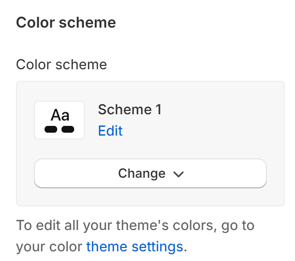
Color scheme:
This feature allows you to use pre-defined colour schemes within the header – If you already have a colour scheme chosen, you can edit your header from this section.
Note: This is a feature that targets the colours in the header specifically – if you wish to edit all of the theme’s colours, you can do so from Customize > Theme Settings > Colors, or you can click the link saying “theme settings” in the note of this section.
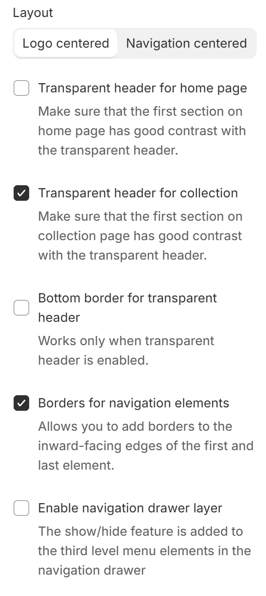
Layout:
This feature presents multiple options for a better design experience. You can choose the logo's position (currently centre and left) by switching it with the navigation.
Additionally, for design purposes, you can choose to use the following options:
- Transparent header for home page
- Transparent header for collection
- Bottom border for transparent header
- Borders for navigation elements
- Enable navigation drawer layer
Note: These features are self-explanatory; however, please check the notes underneath each feature as they come with information regarding the better use of each feature.
Logo:
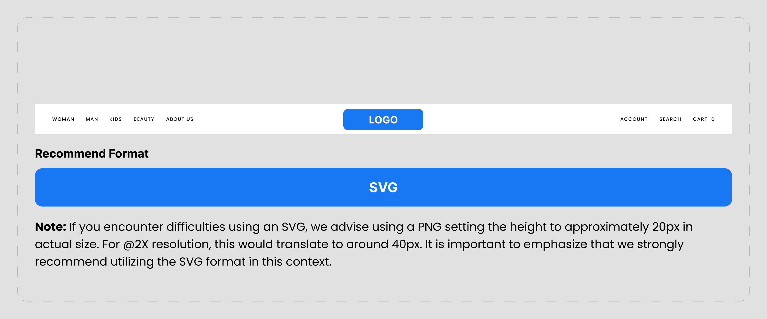
This section enables you to add and select the image for your logo and also allows you to choose a second logo when the transparent header feature is activated. This secondary logo will switch with the original logo as the user scrolls down the page.
The width of the logo can be edited up to 200px for both desktop and mobile views, and the section includes a font size for text logos only.
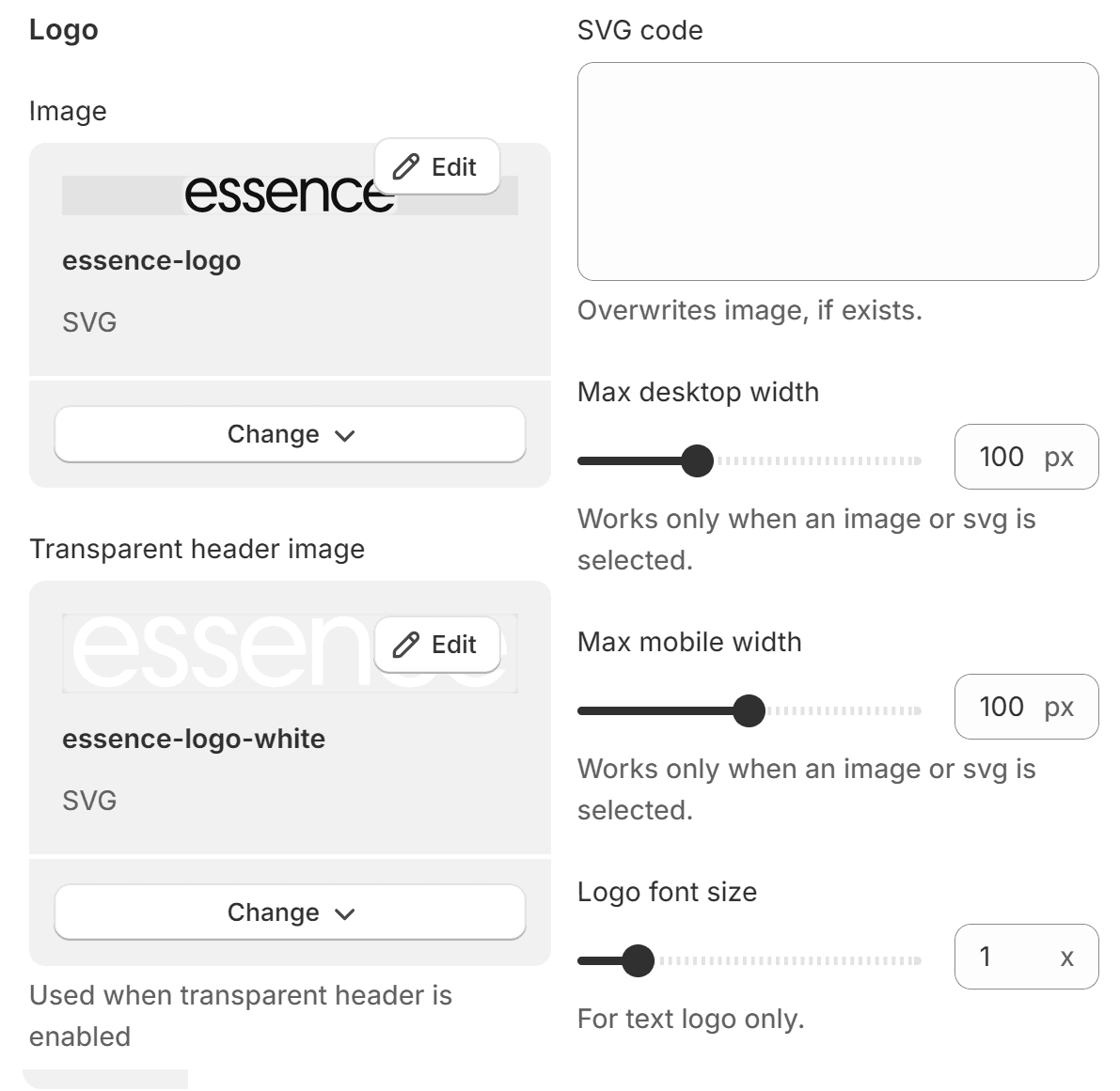
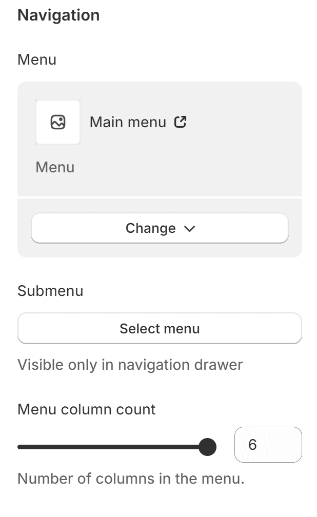
Navigation:
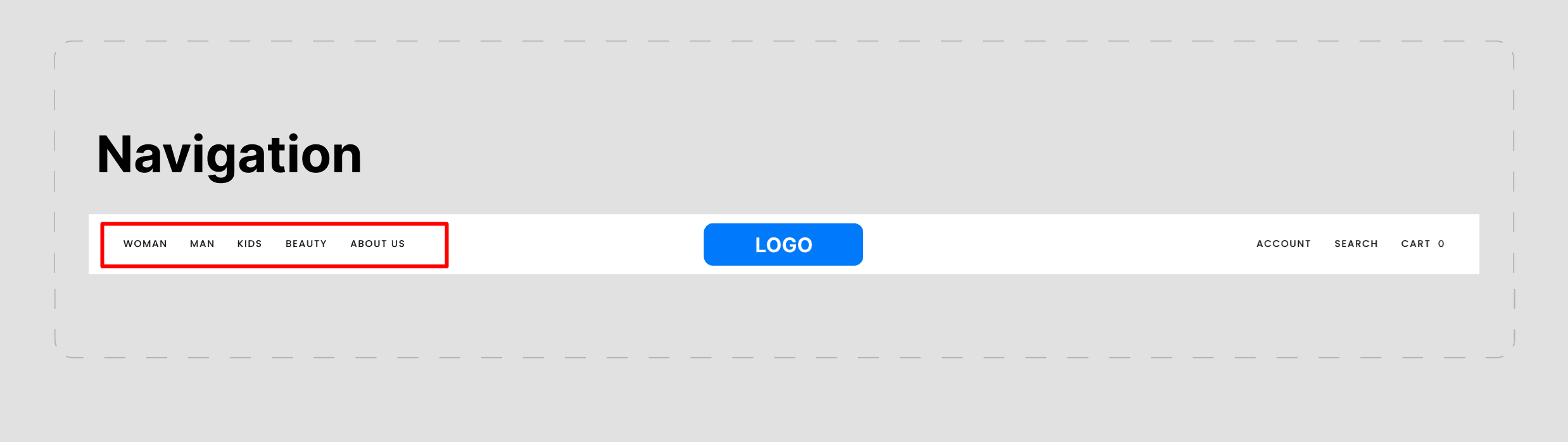
As the name implies, you can choose the menus you’ve created in your Shopify backend to be displayed in this section.
You can find both Menu and Submenu options here; however, the submenu is only visible in the navigation drawer.
Additional options:
Menu column count – With this option, you can choose the number of columns in the menu (up to 6 columns)
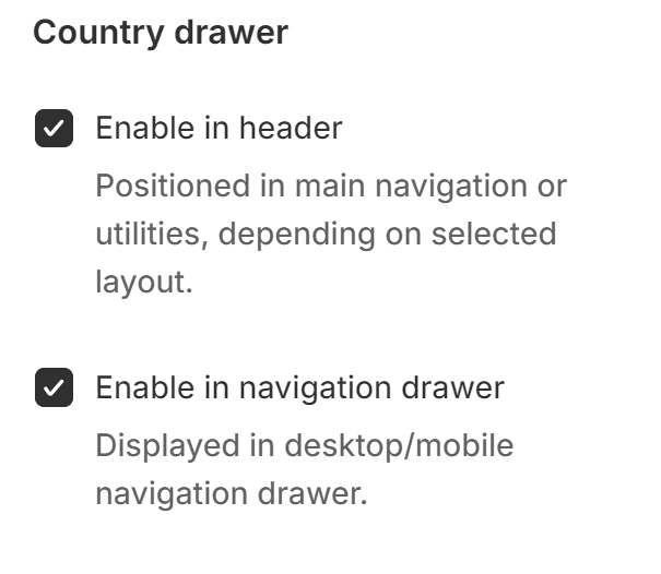
Country drawer
This is a feature where customers can select their country for a better experience when navigating your store. This will change the store’s currency based on the customer’s choice; it will not change the language as well.
There are two options available in this section:
- Enable in header
- Enable in the navigation drawer
Note: Please check the information provided beneath each feature to understand its role better.
By accessing the Theme settings section at the bottom of the page, you can see additional options to edit the country drawer’s display option (by default, you will see “Country name”, but in addition to this, you can also select the currency symbol and country code)
Additional links
This convenient feature allows you to customise up to two additional links that will be available in your header. You can link pre-determined links from within Shopify or a dynamic source.
The feature is enabled so long as the Title section includes any text, and the additional link will be positioned in the main navigation or utilities, depending on the selected layout.

Image and text card
This feature goes hand in hand with the navigation, specifically a megamenu that you’ll have to create in the backend of your store Online Store > Navigation.
You can create multiple such sections to add design elements to your navigation.
With this feature, you can create a card linked to a product or collection in the specified menu title. Each new image card can be added by clicking on "Add image and text card"
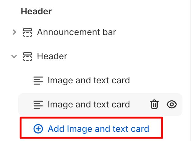
Note: you can find the exact steps on how to create the megamenu with the help of Image and text cards by following this link
Contact UsWas this article helpful?
Have more questions? Submit a request